
THE PROBLEM
Ride-hailing becomes stressful when riders are unsure where to meet the driver, what they are likely to pay, whether the arriving vehicle is theirs, or what happens when the trip stops going as planned.
A ride-hailing experience designed to reduce uncertainty around pickup, pricing, verification and recovery.

[OVERVIEW]
Ride-hailing becomes stressful when riders are unsure where to meet the driver, what they are likely to pay, whether the arriving vehicle is theirs, or what happens when the trip stops going as planned.
I owned the product experience end to end, defining the rider journey, mapping states and recovery paths, exploring wireframes, building the visual system, designing 64 final screens, prototyping the experience and preparing developer handoff documentation.
The result was a complete rider experience covering the core booking journey, safety and verification, failure recovery, account and support, supported by 64 final screens and 106 interactive prototype views.
ROVA is a Nigeria-first ride-hailing rider app concept built around one question: how can a ride feel clear before it even begins?
I started by looking beyond the basic “request a car” happy path. A rider also needs confidence that the driver can find the pickup, that the estimated fare is understandable, and that the arriving driver and vehicle can be verified.
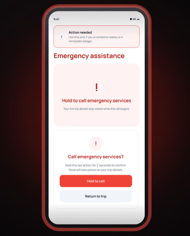
That pushed the project from a small booking flow into a fuller product system covering access and setup, destination search, ride selection, driver matching, pickup, the active trip, payment, recovery states, account and support.
The goal was not to create the largest number of screens. It was to design enough of the system that the experience could behave coherently when things went right and when they did not.
[CHALLENGE]
The booking action itself was not the hardest part of the experience. The harder problem was uncertainty at the moments where the rider had to trust the system enough to continue. Before requesting a ride, the rider needs to know where the driver will meet them, what the trip may cost and what happens after they commit. At pickup, they need enough information to verify the driver and vehicle. During disruptions, they need the system to preserve useful context instead of forcing them to start again.
In ride-hailing, uncertainty appears immediately before important commitments: confirming a pickup, requesting a ride, entering a vehicle or accepting a fare change. If the interface hides important information at these moments, the rider has to make decisions with less confidence.
GPS coordinates alone do not always create a meeting point both rider and driver can easily understand.
Fare estimates, driver identity and vehicle information need to appear before the rider is asked to make the corresponding decision.
The rider should always understand where they are in the journey, what is known, what is still changing, and what action is expected next.
[CONTEXT]
The primary experience was designed around a 390 × 844 Android viewport, which forced important ride information and actions to remain usable within limited vertical space.
ROVA is a concept rather than a launched service, so I could not use production analytics or real operational data to validate every assumption.
Several parts of the experience depend on changing information such as GPS, driver availability, fare estimates, network connectivity and payment status. The interface therefore needed states for uncertainty and recovery rather than assuming perfect conditions.
A rider should be able to understand and correct the pickup point before requesting a ride.
Important commitment information, estimated fare, ride choice and vehicle verification, should appear before the relevant decision.
When GPS, network, matching or payment fails, the experience should preserve known information and provide a clear next action rather than resetting the journey.
EVIDENCE
.png)
I started with the original seven-screen learning flow and audited where the journey stopped explaining what happened next. That exposed missing states around permissions, pickup correction, driver matching, fare changes, payment and support.
.png)
I mapped the rider journey from access and setup through trip completion, then layered in the states that could interrupt it, loading, empty, error, cancellation, offline and recovery. This turned a screen list into a connected product system.
.png)
I stress-tested the journey with practical rider scenarios: What if GPS is wrong? No driver is available? The driver cancels? The network drops? Payment fails? Each scenario had to preserve useful context and give the rider a clear next action.
[THE KEY INSIGHT]
The real design problem wasn't requesting a car. It was reducing uncertainty at every point where the rider had to trust the system enough to continue.
That changed how I approached the product. Pickup clarity became more than a map pin. Fare clarity became more than displaying a number. Safety became more than an emergency button. And failure states became part of the primary experience instead of screens to add at the end.
PROCESS
Understand the problem, users, business context and constraints before deciding what to design.
Turn evidence into a clearer information structure, flow and product direction.
Test the strongest direction, refine the interface and prepare the experience for delivery.
Audit: reviewed the original seven-screen happy path and identified where the experience stopped explaining what happens next.
Structure: mapped the full rider journey and grouped missing states across setup, destination, matching, trip, payment and account/support.
Design: created 18 key-decision wireframes, built the visual system and expanded the product into 64 final screens.
Prototype: connected 106 interactive views so the core journey and recovery paths could be experienced as a system.
Handoff: documented states and behaviors for developer handoff rather than treating the work as isolated mockups.
KEY DECISIONS
Problem: Current GPS location is not always the best pickup point, especially around gates, landmarks, large buildings or difficult road access.
Decision: I treated current location, pickup and destination as separate concepts. Riders can adjust the pickup pin, use landmarks and add pickup notes before requesting.
Why: A map coordinate may be technically accurate while still being difficult for two people to interpret in the real world.
.png)
.png)
Problem: Ride pricing can change based on route and demand, but hiding that uncertainty makes the interface look more certain than the system actually is.
Decision: ROVA presents the estimated fare while the rider compares ride options, explains what the estimate represents and distinguishes estimated pricing from the confirmed/final amount.
Why: The interface should communicate what the system knows, not create false certainty.
Problem: A typical happy-path prototype can look complete while breaking as soon as matching fails, GPS becomes unreliable, the driver cancels or payment does not go through.
Decision: I designed recovery locally: preserve information that is still valid, clearly mark what has become uncertain and provide the smallest next action needed to continue.
Why: A temporary failure should not force the rider to repeat work that the product already knows.
.png)
FINAL EXPERIENCE
PROJECT PROOF
64 final product screens · 18 key-decision wireframes · 106 interactive prototype views · failure and recovery states · developer handoff documentation
.png)
.png)
.png)
DESIGN EVOLUTION
Use this module to compare two meaningful stages of the work — from exploration to final execution.
BEFORE
AFTER
DELIVERY
Delivered: The core booking prototype contains 83 reachable portfolio views, with the journey connected from onboarding through active-trip states.
Scope: 64 final screens, 18 key-decision wireframes and 106 connected prototype views across the rider journey and its failure/recovery states.
Important: ROVA is a portfolio product concept, not a live production app, so I am not attaching invented conversion, retention or usability metrics to the outcome.
REFLECTION
States are part of the product, not cleanup work. Designing loading, failure, cancellation and recovery alongside the happy path changed how complete the experience felt.
Preserve known state. Mark uncertainty. Block only what truly requires the network. This became one of the strongest principles I developed during ROVA.
The next step is evidence. If ROVA were moving toward production, I would test pickup comprehension, fare communication and verification behaviour with real riders before expanding the feature set.
.png)
