
THE PROBLEM
Coaching is difficult to evaluate before you experience it. Visitors aren't buying a physical product. They're deciding whether they trust a person, relate to an approach and believe coaching can help their situation.
Turned an intangible coaching offer into a clear, trust-led one-page experience that guides ambitious professionals from self-recognition to action.
.png)
[OVERVIEW]
Coaching is difficult to evaluate before you experience it. Visitors aren't buying a physical product. They're deciding whether they trust a person, relate to an approach and believe coaching can help their situation.
Strategy through implementation. I handled the experience from discovery and content direction through wireframing, visual design, responsive thinking and Webflow development.
Turn interest into qualified action. The experience builds relevance and trust before asking ready visitors to start a conversation, while giving lower-intent visitors a valuable way to stay engaged.
Mindset Mastery Coaching is a concept website created for Michael Carter, a mindset and performance coach helping ambitious professionals overcome self-doubt, limiting beliefs, overthinking, and lack of clarity.
The challenge was translating an intangible, trust-dependent coaching service into a digital experience people could quickly understand and feel confident acting on. Rather than starting with visual design, I approached the project from the business and user side first—clarifying the audience, offer, pain points, objections, available content, and desired actions through a structured discovery process.
Those findings shaped the information architecture, messaging, wireframes, visual direction, and eventually the Webflow implementation. The result is a one-page experience designed to move visitors through a deliberate sequence: recognition → understanding → trust → proof → action, while providing both a direct booking path and a lower-commitment lead-capture path.
[CHALLENGE]
Mindset coaching can feel abstract before someone experiences it. The challenge was helping ambitious professionals quickly understand what Michael actually helps with, recognize themselves in the problems he addresses, and feel enough trust to consider taking the next step.
.png)
Coaching is a high-trust, personal decision. If visitors can't quickly understand who the coaching is for, what problems it addresses, and why they should trust the coach, even a visually impressive website can leave them uncertain.
The value of “mindset coaching” wasn't immediately tangible. The experience needed to translate an abstract service into familiar problems—self-doubt, overthinking, lack of clarity, limiting beliefs, and inconsistent performance.
Trust had to be earned before asking for commitment. Visitors weren't simply evaluating a service. They were deciding whether Michael felt credible, relatable, and capable of helping with challenges that can be deeply personal.
The website should feel like a guided conversation: “I understand what you're experiencing → here's how I can help → here's why you can trust the process → here's your next step.”
[CONTEXT]
The experience had to establish Michael as credible and approachable without relying on aggressive sales language. Visitors needed enough confidence in the person before considering the coaching.
Unlike a physical product, the value of mindset coaching can't be demonstrated instantly. The content and interface had to make the problems, process and potential outcomes easier to understand.
Not every visitor would arrive ready to book a call. The experience needed to support high-intent prospects while giving less-ready visitors a lower-friction way to engage and stay connected.
A first-time visitor should understand who Michael helps, what he helps them overcome, and what action to take within the opening screen.
The page should progressively build recognition → understanding → trust → proof → action, rather than asking visitors to commit before enough value and credibility have been established.
The experience should remain clear and usable across desktop, tablet and mobile, while preserving the personality and visual character of the brand.
EVIDENCE
.png)
I translated the discovery conversation into audience needs, page goals, conversion paths and content priorities before moving into visual design. Early wireframes helped test whether the experience answered the right questions in the right order.
.png)
I reviewed coaching and personal-brand websites to understand how they communicated authority, personality, proof and calls to action. The strongest references made the individual visible early and kept the path to action simple, while weaker examples relied heavily on generic motivational messaging.
.png)
The discovery brief surfaced the core requirements: speak directly to ambitious professionals, make Michael's personality central to the experience, communicate transformation without overpromising, and provide paths for both visitors ready to talk and those still building trust.
[THE KEY INSIGHT]
The site didn't need to sell coaching harder. It needed to make the right person feel understood first.
That became the rule for the experience: create recognition → make the problem tangible → establish trust → explain the path forward → prove progress → offer the right next step.
PROCESS
Understand the problem, users, business context and constraints before deciding what to design.
Turn evidence into a clearer information structure, flow and product direction.
Test the strongest direction, refine the interface and prepare the experience for delivery.
Discovery: defined the target audience, coaching offer, pain points, objections, content needs and conversion goals. This established what visitors needed to understand, feel and do before any visual decisions were made.
Research: reviewed coaching and personal-brand experiences, gathered visual references and built a moodboard to identify useful patterns around authority, trust, storytelling, social proof and calls to action without simply copying competitor layouts.
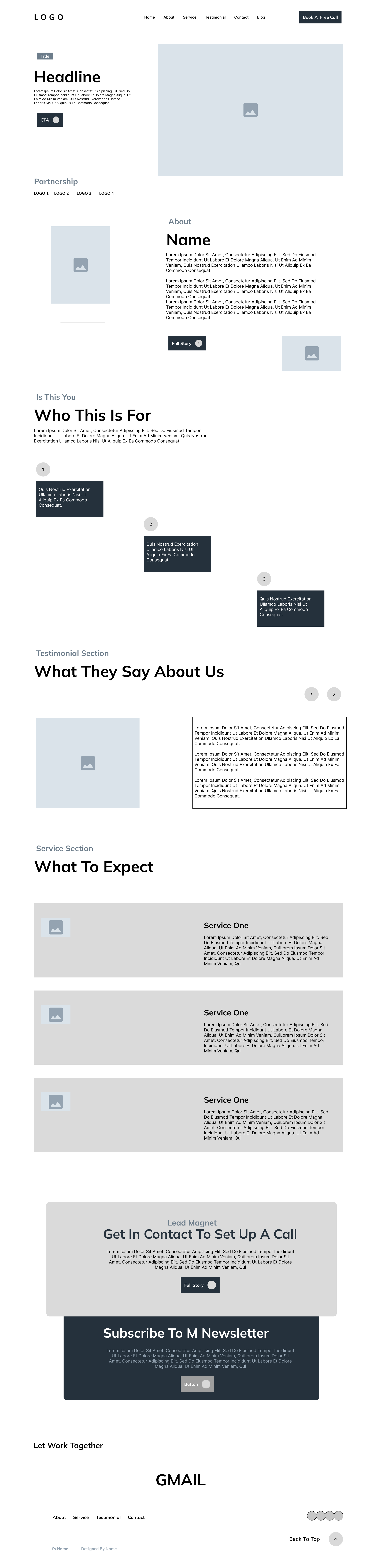
Structure: translated the discovery findings into a one-page journey built around recognition → understanding → trust → proof → action, then used low- and mid-fidelity wireframes to test hierarchy, section order, content density and CTA placement.
Content: shaped the website messaging alongside the interface so each section had a specific job—from making the audience and problem clear in the hero to helping visitors self-qualify, understand the coaching offer and decide on a next step.
Visual Design: developed the dark, high-contrast visual system with lime accents, expressive typography, coach-led imagery and intentional decorative elements. The system was designed to feel distinctive and premium while keeping important content easy to scan.
Development: translated the approved Figma experience into Webflow using reusable structures, responsive layouts and purposeful interactions, then refined the experience across desktop, tablet and mobile rather than treating smaller breakpoints as scaled-down desktop screens.
QA & Refinement: reviewed hierarchy, responsiveness, navigation, readability, forms, interactions and CTA behaviour across breakpoints, making implementation adjustments where the live experience exposed issues that weren't obvious in static Figma screens.
KEY DECISIONS
The hero was designed around the questions a first-time visitor is likely to have immediately: Who is this for? What does Michael help with? And what can I do next? Instead of opening with a broad motivational statement, the messaging identifies ambitious professionals, connects the offer to limiting beliefs, self-doubt and clarity, and provides an immediate next step. Michael's portrait keeps the person behind the coaching visible from the start, while supporting trust signals reduce uncertainty without competing with the primary message.
.png)
.png)
Rather than moving directly from the hero into a list of coaching services, I introduced a self-qualification section built around situations the target audience may already recognize, second-guessing decisions, feeling stuck despite effort, struggling for clarity, or wanting sustainable progress. This shifts the conversation from “Here are my services” to “Does this sound like what you're experiencing?”, helping visitors establish relevance before being asked to evaluate the offer.
Not every relevant visitor will be ready to speak with a coach on their first visit. The experience therefore supports two levels of intent: visitors who are ready can book a free call, while those still evaluating can access the free mindset guide or newsletter and remain connected. This reduces the all-or-nothing nature of the journey while keeping both paths aligned with the same long-term goal—building enough trust for meaningful action.
.png)
FINAL EXPERIENCE
PROJECT PROOF
The Mindset Mastery experience was translated from its desktop visual system into responsive layouts across desktop, tablet and mobile, preserving the clarity, trust signals and conversion paths that mattered most rather than simply shrinking the original composition.
.png)
.png)
.png)
DESIGN EVOLUTION
Use this module to compare two meaningful stages of the work — from exploration to final execution.
BEFORE
AFTER
.png)
DELIVERY
Delivered: The FinSH experience was taken from early structure and stakeholder feedback through high-fidelity UI and into a responsive Webflow build, covering the Home, Accounting Services and Tax Services journeys.
Scope: Three core pages, a reusable visual system, responsive desktop/tablet/mobile layouts, service and industry patterns, testimonials, FAQ interactions, tax-process timeline, conversion CTAs and the supporting Webflow implementation.
Important: FinSH is a real client project, but I’m not attaching invented conversion or engagement metrics to the outcome. The strongest evidence at this stage is the completed design system, responsive implementation and clearer structure created for the client experience.
REFLECTION
Clarity has to come before persuasion. The project reinforced that a coaching website cannot rely on polished visuals alone. Before asking visitors to trust Michael or book a call, the experience had to establish who the coaching was for, what problems it addressed, and what kind of change visitors could expect.
Trust is built across the journey, not in one section. Michael’s presence, relatable pain points, client experiences, clear service explanations and low-friction calls to action were intentionally distributed throughout the experience. Together, they reduce uncertainty without relying on a single “trust” section.
Responsive design is really content prioritization. Moving the experience from Figma into Webflow required more than shrinking the desktop layout. Messaging, imagery, proof and calls to action had to be reprioritized across tablet and mobile so the core story remained clear at every breakpoint.

