
THE PROBLEM
FinSH offered accounting, tax and advisory services, but the breadth of the offer needed a clearer structure so visitors could quickly understand what the firm does, who it serves and where to go next.
Turning complex financial services into a clear, trust-led experience that guides growing businesses toward confident action.
.png)
[OVERVIEW]
FinSH offered accounting, tax and advisory services, but the breadth of the offer needed a clearer structure so visitors could quickly understand what the firm does, who it serves and where to go next.
I led the experience from information architecture and visual design through responsive prototyping, stakeholder review and Webflow implementation.
A three-page, trust-led website system that makes services easier to scan, strengthens credibility and creates clearer paths toward consultation.
FinSH is a solo CPA advisory practice serving founders, growing businesses, nonprofits, families and other organizations. The founder wanted the website to feel more strategic and premium than a traditional accounting site while remaining personal, credible and easy to understand.
[CHALLENGE]
FinSH needed to communicate several interconnected services without forcing visitors to decode long explanations or understand accounting terminology before knowing what was relevant to them.
.png)
Visitors are making high-trust decisions. If the offer feels complicated, generic or difficult to navigate, the website creates more uncertainty instead of reducing it.
Services, industries and advisory content could easily become dense without a strong scanning structure.
As a solo CPA practice, the experience needed to communicate credibility and expertise without presenting FinSH like a large corporate firm.
The website should feel like a strategic advisor guiding the visitor—not a catalogue of accounting services.
[CONTEXT]
Messaging and UI had to reinforce a personal CPA relationship without implying a large internal team.
Services, testimonials, FAQs and process content changed during review, so the system had to absorb new information without breaking the visual hierarchy.
Layouts needed to translate into reusable, responsive Webflow structures—not just look good at 1440px in Figma.
A first-time visitor should understand what FinSH offers and who it serves within the opening scroll.
Services and industries should be easy to scan before visitors commit to reading detailed content.
The experience should remain consistent and usable across desktop, tablet and mobile.
EVIDENCE
I mapped the growing service content into page goals, hierarchy and reusable content patterns before refining the visual system.
Financial-service references consistently used trust markers, service summaries and process explanations—but many became text-heavy or visually generic.
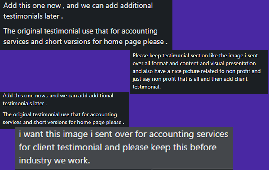
Stakeholder review repeatedly emphasized stronger readability, natural imagery, clearer service emphasis, process transparency and visible social proof.
[THE KEY INSIGHT]
The site didn't need more information. It needed a better order for the information visitors already needed.
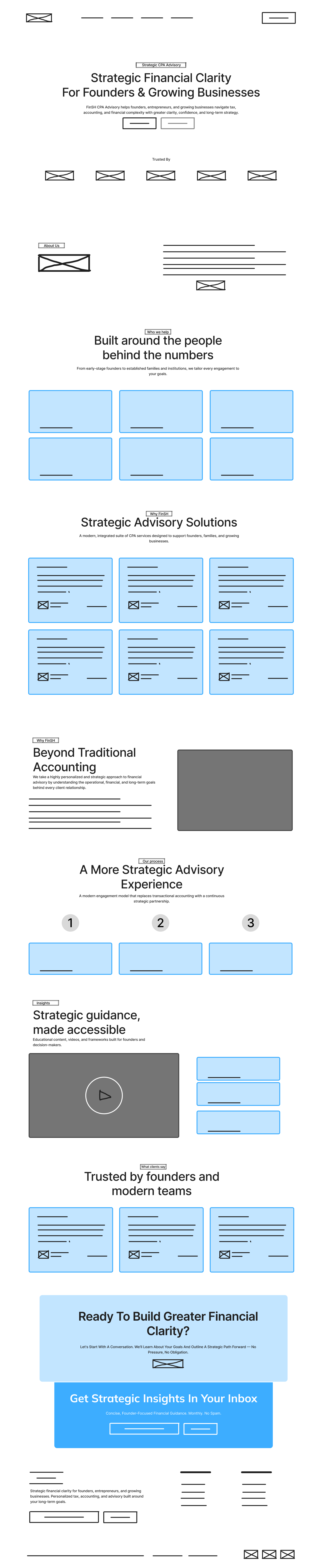
That became the rule for every page: explain the value → prove credibility → make the offer scannable → deepen the detail → provide a clear next step.
PROCESS
Understand the problem, users, business context and constraints before deciding what to design.
Turn evidence into a clearer information structure, flow and product direction.
Test the strongest direction, refine the interface and prepare the experience for delivery.
Audit: reviewed FinSH’s growing accounting, tax and advisory content, stakeholder feedback, and reference sites to identify where the experience needed stronger hierarchy, trust and clarity.
Structure: mapped the three-page journey across Home, Accounting Services and Tax Services, then organized services, industries, testimonials, process content and CTAs into a clearer narrative.
Design: created the visual system, refined the page hierarchy through multiple review cycles, and developed responsive high-fidelity designs that balanced credibility, readability and conversion.
Development: translated the approved Figma designs into Webflow, building reusable classes, responsive layouts, interactions, accordions and testimonial patterns across desktop, tablet and mobile.
Handoff: structured the Webflow project for client ownership, with clear hosting, domain and maintenance responsibilities so the site could be launched and managed beyond the design phase.
KEY DECISIONS
Rather than placing testimonials at the very bottom of the experience, I used a short proof point near the homepage opening and a fuller client story deeper within the Accounting Services journey. This gives new visitors an early credibility signal while preserving depth for people actively evaluating the service.
.png)
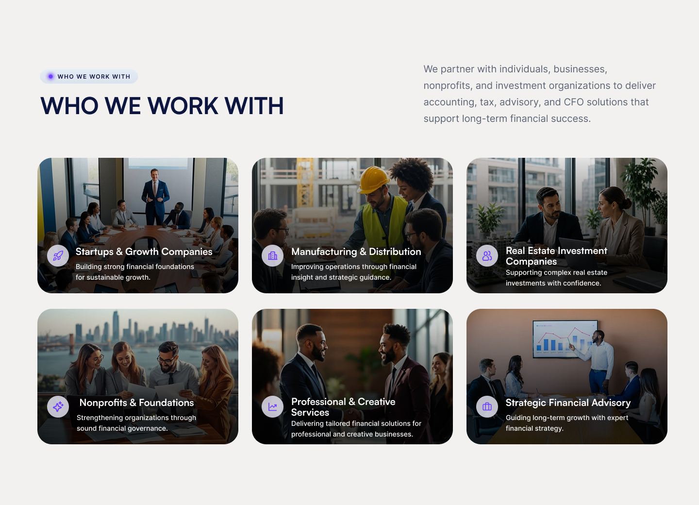
Accounting and advisory content can become overwhelming quickly. I introduced summary cards with concise descriptions before the detailed service sections so visitors could understand the offer at a glance and navigate directly to the service most relevant to them.
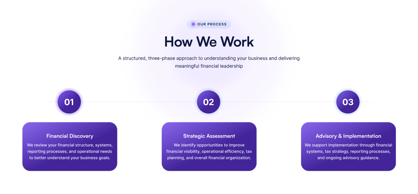
The original tax-process presentation treated every step like an equal card. As the content became more detailed, I redesigned it as a week-by-week timeline with deliverables and milestones, helping visitors understand not only what happens—but what they receive at each stage.
FINAL EXPERIENCE
PROJECT PROOF
The FinSH experience was translated into a responsive Webflow system across desktop, tablet, and mobile, preserving hierarchy, readability, and conversion paths at every breakpoint.
.png)
.png)
.png)
DESIGN EVOLUTION
Use this module to compare two meaningful stages of the work — from exploration to final execution.
BEFORE
AFTER
.jpeg)
DELIVERY
Delivered: The FinSH experience was taken from early structure and stakeholder feedback through high-fidelity UI and into a responsive Webflow build, covering the Home, Accounting Services and Tax Services journeys.
Scope: Three core pages, a reusable visual system, responsive desktop/tablet/mobile layouts, service and industry patterns, testimonials, FAQ interactions, tax-process timeline, conversion CTAs and the supporting Webflow implementation.
Important: FinSH is a real client project, but I’m not attaching invented conversion or engagement metrics to the outcome. The strongest evidence at this stage is the completed design system, responsive implementation and clearer structure created for the client experience.
REFLECTION
Approval points matter as much as design decisions. The project reinforced the value of defining clear review checkpoints before moving from design into development, especially when content and stakeholder feedback continue to evolve.
Trust should be designed into the journey. Testimonials, process transparency, service hierarchy and clear calls to action worked together to make the experience feel more credible without relying on decorative “trust” elements.
Responsive design is not desktop scaled down. Moving the approved Figma direction into Webflow required deliberate changes to spacing, hierarchy, card behavior and content flow across tablet and mobile rather than simply shrinking the desktop composition.
.png)
